Sage
Designed and conducted a small-scale usability test of Sage, a digital platform offering mental health resources to students.
![]()
Role: UX Researcher & Writer
Timeline: Nov. 2018
Overview
As a Behavioral Science fellow at the University of Michigan’s Office of Academic Innovation, I planned and conducted a usability test of Sage and then worked with the development team to implement recommendations before the pilot launch.
Background
Sage is part of the Office of Academic Innovation’s software portfolio. It offers tailored mental health resources to students after they’ve completed the Healthy Minds Study, which is an annual, national survey of student mental health. It also allows students to periodically check in about their mental health. Sage then provides students updated resources and a visualization of their mental health status over a period of time.
Methodology
Before a pilot launch of the platform, the development team requested a usability test to get a sense of how actual students would navigate and use the platform.
The Office’s Student Program Coordinator helped me recruit five participants.
In designing the test protocol, I didn’t want participants to feel obligated to reveal anything about their personal mental health statuses, so I had them adopt a persona during tasks, especially those that involved the check-in survey, which asks personal questions about mental health.
The persona was Sam: An LSA junior and recently completed the Healthy Minds survey. Among other things, they indicated that they are worried about their future and are experiencing feelings of depression and anxiety.
The tasks participants were asked to complete on Sage were as follows:
- Save two of the suggested resources that you feel would be most relevant or helpful to Sam.
- From a list of all the resources available, find those that are available in person.
- Fill out a check-in survey to reflect a slight upturn in Sam’s mental health.
- After you’ve completed the check-in survey, review and interpret the visualization.
- Retake the check-in survey to reflect a slight downturn in Sam’s mental health. Review the visualization and Sam’s feedback. Then, adjust the goal line.
After completing the tasks, participants were asked about their overall impressions of Sage, what they liked least and most about Sage, and what changes they’d make to Sage if they could.
Findings & Recommendations
I took notes during and recorded each usability test, aggregating the issues and prioritizing the findings afterwards based on how many participants ran into a particular issue. The findings included
- non-intuitive navigation
- barebones results visualization
- missing connection between check-in survey feedback and suggested resources
- unexpected functionality of “Show Other Resources” button
- multi-step filter
From the most significant of these findings (the ones that seemed to influence usability of Sage the most) come the following recommendations:
| No. | Finding | Recommendation |
|---|---|---|
| 1 | Non-intuitive navigation | Add “Check-in Survey” as a standalone menu item. (After completing a check-in survey, the user can then be automatically brought to their “My Results” page.) |
| 2 | Non-intuitive navigation | Allow for tabbing functionality through check-in survey; add focus indicators to survey questions and answer options. |
| 3 | Barebones results visualization | Add labels to the X and Y axes on the results visualization. |
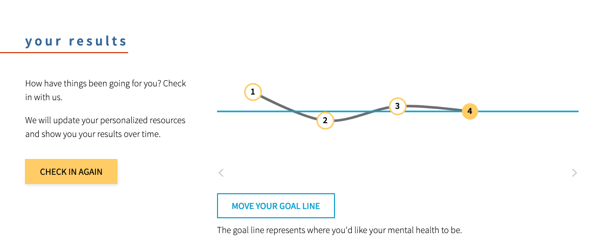
| 4 | Barebones results visualization | Add a short description of the goal line under the “Move Your Goal Line” button, explaining what it (and what moving it) signifies. |
| 5 | Missing connection between check-in survey feedback and suggested resources | Reference and link to suggested resources from the check-in survey feedback. |
Recommendations 1, 2, 4 and 5 were implemented before the pilot launch of Sage.
While the design and development team handled the details of recommendations #1, 2, and 5, I crafted the microcopy for recommendation #4, and the difference is shown in the screenshots below.
Old “Goal Line” Button
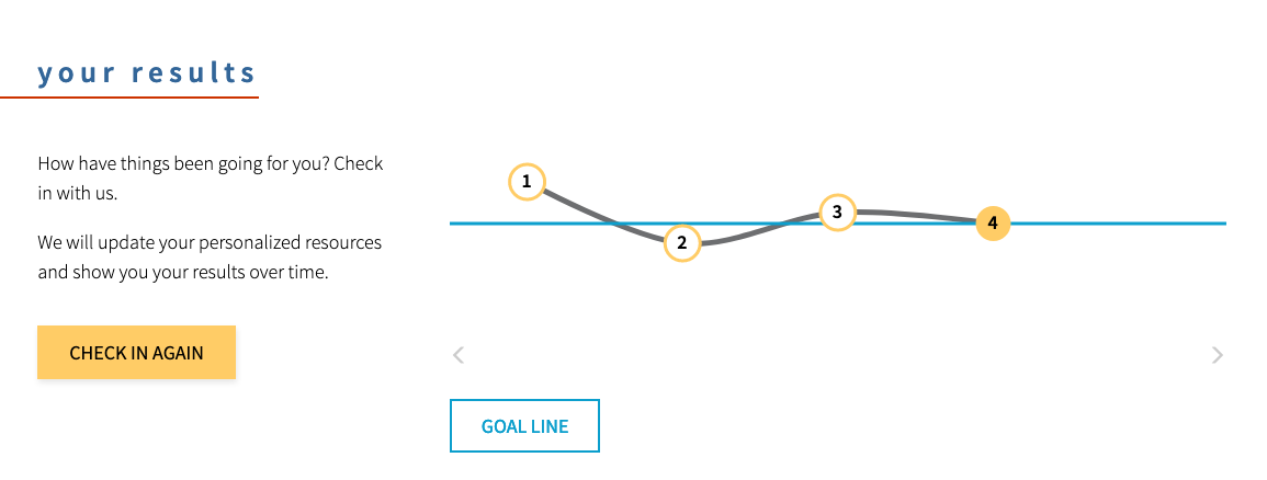
New “Goal Line” Button