Dassault Systèmes
Contributed to brand UX specifications and guidelines at a proprietary simulation software company, developed templates for task analysis, and designed surveys and usability studies.

Role: UX Researcher
Timeline: May - Aug. 2018
Overview
I spent summer 2018 in Providence, Rhode Island, working as a UX research and design intern with Dassault Systèmes’ SIMULIA brand. Dassault Systèmes (DS) is a French company that develops 3D design software, and SIMULIA is one of its enterprise brands, encompassing all DS’ simulation software products.
I worked on a team with seven other UX designers and about the same number of user assistance developers under the brand’s User Experience Director, who was my mentor. I spent most of my time on research projects, mainly usability tests, surveys, and tree tests; I also contributed to the brand’s UX specifications and developed templates for task analysis.
Due to confidentiality agreements, I can’t discuss the specifics of most of this work, though I can explain how I developed templates for task analysis.
Background
I created these task analysis guidelines and templates for managers and engineers to use in error reporting and documentation development.
Methodology
Throughout this project, I worked with a UX design senior manager. At our first meeting, he explained to me that there was an internal need for some sort of documented explanation or walkthrough of task analyses for non-designers. Site engineers and managers often had to break down a task into its constituent parts or recognize the tasks that comprised a complicated workflow for the purposes of error reporting and documentation development, but there was no consistency in how task analyses were completed, in format or level of specicity.
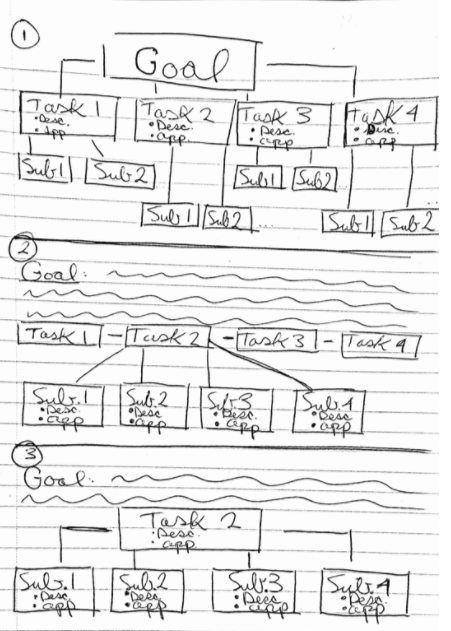
After our first meeting, I sketched out some basic outlines of what a complete task analysis might look like:

The UX design senior manager and I met again to discuss these outlines. He explained that a neat visualization of the tasks wasn’t really needed; we didn’t want to require non-designers to spend time drawing straight lines and symmetrical boxes to design diagrams. The explanation of tasks and subtasks was a much more important outcome of their work.
To illustrate this point, I met with a site engineer who was currently working on breaking a complex work process down into its constituent parts. He walked me through the process itself and then how he was approaching the analysis. That conversation highlighted the need for the work I was doing and put me in a better position to effectively empathize with site engineers and managers, those who would be the users of my work.
With this feedback and insight, I, through many iterations, wrote a brief introduction to the process of task analysis and a quasi-form for non-designers to use that would help them break their tasks down to a appropriate level of detail.
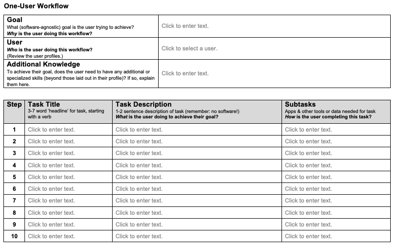
This quasi-form, within a Microsoft Word document, is meant to guide site engineers and managers through the analysis process in a manageable way. Rather than have them start from scratch each time, this quasi-form is meant to begin the work of scoping the process for them.
Outcome
The last iteration of this document contains two parts: an explanation of task analyses in general and two quasi-forms that can help with the actual process of task analysis. One form is for workflows completed by only one person (shown below), and the other form is for multi-person workflows.
