Expectant
Conducted secondary research, competitive feature analyses, and interviews to inform design and content decisions for an app that helps people tell their pregnancy stories through directed journaling and narrative visualization.

Role: Project Manager, UX Researcher, Writer & Designer
Timeline: Jan. 2019 – May 2019
Overview
As part of the UX Research & Design Mastery Course at the University of Michigan (SI*699), my team and I designed an app that helps people tell their pregnancy stories through directed journaling and narrative visualization, offering tailored support resources and access to community forums in cases of loss.
Background
This project started as a way to address the often unconsidered experience of pregnancy loss for users of pregnancy-tracking apps. Up to 20% of known pregnancies result in loss, but most apps aren’t designed to handle this use case in a dignified, careful way or even at all.
In a 2018 Mashable article, Olga Massov wrote that, after experiencing a miscarriage, that “it wasn’t until [she] logged onto the app’s website on [her] computer that [she] discovered there was no option to label a pregnancy ending in a miscarriage. [She] could either delete the pregnancy entirely or let the app believe [she] was still pregnant.” Another article, in The Atlantic, recounts the experiences multiple women have had after experiencing pregnancy loss: “she [Cindy Jenkins] found the process of getting rid of her Glow account to be cumbersome, which only amplified her pain. ‘It should have been easier to figure out how to ‘report a loss,’ which is what they call it,’ Jenkins told me.”
So, with this project, we aimed to pick up where most pregnancy-tracking apps fail: handling cases of early or unexpected pregnancy loss in dignified ways—not treating them as edge or stress cases, but as normal, expected use cases—and designing a solution that thoughtfully facilitates or provides relevant support, space, and healing.
Methodology
Competitor Feature Analysis
We started by conducting a competitive feature analysis of the 10 most popular pregnancy-tracking and fertility/period-tracking apps across the App and Google Play stores. For each app included in our analysis, we noted which common features were present and how it handled instances pregnancy loss, if at all.
This analysis revealed a consistent lack of support from apps in addressing pregnancy loss. In the worst cases, some apps don’t allow users to report a loss and thus force them to abandon or delete the apps completely.
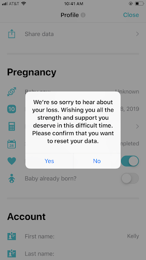
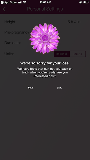
More frequently, however, apps allowed users to report a loss, acknowledging the loss by offering a sympathetic message.

This doesn’t address the issue at hand, though, as these apps are quick to advertise their companion fertility tracking app or suggest that the user come back when they’re “ready to try again”.

Secondary Literature Review
Using Google Scholar and the U-M Library’s database search tools, we searched through the PubMed, PubMed Central, SAGE, and Taylor & Francis databases with the search terms “miscarriage”, “stillbirth”, “perinatal loss”, “pregnancy loss”, “pregnancy loss + grief”, and “pregnancy loss + support”. We found 15 articles related to pregnancy, pregnancy loss (miscarriage and stillbirth), and support after pregnancy loss.
From our secondary research, we learned about the unique grief process associated with pregnancy loss, the symbolic and often multifaceted nature of this type of loss, and best practices for supporting people experiencing this type of loss, including memorializing the loss, receiving emotional validation from professionals, getting information from and having contact with professionals, receiving emotional validation from peers, and making meaning of the loss.
Survey
We created our survey as a means to both gather data and recruit and screen participants for subsequent interviews. The primary goals of the survey were to learn what participants found useful about pregnancy-tracking apps, what types of information participants most relied on pregnancy-tracking apps for, and how participants who experienced unexpected pregnancy found support and resources.
We used Qualtrics to create our survey and then distributed the survey via social media platforms (Facebook and Twitter), a school-wide listserv, and /r/miscarriage on Reddit.
Our goal was to collect 30-40 responses, but we exceeded our goal, gathering 99 completed surveys from respondents in five different countries. We decided to analyze the data of the 89 respondents in the United States only to avoid potential skewing due to any possible cultural biases or differences.
Since our survey was comprised of questions with categorical answers, we analyzed our respondents’ answers using frequency tables, bar charts, and cross tabulation.
Most of our respondents were between the ages of 25-34 and 98.9% indicated being pregnant in their lifetime. Of those who indicated a pregnancy, 94.3% reported using a pregnancy-tracking app. The most used features of these apps were growth-tracking visualizations, symptom/health trackers, and educational articles.
Of those who used a pregnancy-tracking app, the vast majority (92.77%) rated their app as at least somewhat helpful. This finding helped us narrow the scope of our solution: it would be unnecessary for our solution to include revamped versions of features that are already well-received, like growth-tracking visualizations.
Interviews
Between February 4, 2019 and February 15, 2019, we interviewed eight people who fit into two groups that we were interested in:
- those who had used pregnancy-tracking apps and had experienced at least one unexpected pregnancy loss and
- those who had used pregnancy-tracking apps while pregnant but hadn’t experienced an unexpected pregnancy loss.
We conducted these interviews using various remote interview methods (by phone, Bluejeans, or Google Hangouts) and followed semi-structured protocols to guide the conversations. Once complete, our interviews were transcribed via Otter.ai, and we each then distilled detailed notes from these transcripts.
We crafted a digital affinity wall to make connections between the experiences, ideas, thoughts, feelings, and opinions brought up by interview participants. Once we had completed interviews and added notes to the affinity wall, we drew thematic connections between all of our notes to support various significant findings we subsequently used to inform our design requirements.

From our interviews, we learned
- Participants were generally excited when they became pregnant for the first time. However, for many, especially after their first pregnancy, these feelings were accompanied by anxiety over the myriad of health complications that can occur during pregnancy.
- There was no generally agreed-upon time or milestone during a pregnancy when participants chose to download pregnancy-tracking apps.
- Apps were chosen and used by our participants for a variety of reasons; however, educational articles and growth-tracking visualizations seemed to be the most commonly used features.
- With the exception of one, none of the pregnancy-tracking apps that our participants used handled pregnancy loss as part of the standard experience.
- Participants who experienced unexpected pregnancy loss were forced to use a variety of means to sever digital ties with their apps as a way and to cease notifications about their pregnancy, including fumbling around in settings and menus and deleting the apps outright.
- Participants experienced a range of thoughts and emotions after a pregnancy loss. Feelings, questions, and now-canceled plans for the future are internalized and perpetually revisited.
- Participants used a variety of support types to help them process their early pregnancy loss, but all felt shortcomings in their support systems.
Requirements
After snynthesizing data from these four research methods, we derived UX requirements for our solution and prioritized each (either “must have”, “should have”, or “nice to have”, in decreasing order of importance) according to our findings.
1. Must have: Create a separate space for healing after a pregnancy loss – avoid pushing users immediately back into a fertility- or period-tracking solution.
2. Must have: Provide ways to users to make sense of their loss.
3. Must have: Avoid “magical thinking” – don’t avoid communicating the hard truths about the prevalence and pain of pregnancy loss, in addition to other complications associated with pregnancy.
4. Must have: Don’t “reinvent the wheel” – don’t include features that are currently well-established in popular pregnancy-, period-, and fertility-tracking periods.
5. Should have: Provide actionable advice that helps users address the psychological, emotional, and mental effects of pregnancy loss.
6. Should have: Provide educational articles and other tools that help users stay informed about the physical effects of pregnancy loss.
7. Should have: Provide ways to communicate with others who’ve experienced pregnancy loss, whether in a user’s social circle or not.
8. Should have: Provide ways for users to memorialize their loss.
9. Nice to have: Use dignified, clear, validating language – no niceties.
Design Concept
With a common understanding of what our solution should include, our team engaged in exploration: each of us sketched what a potential successful solution might look like. After discussing the merits and drawbacks of each, we landed on a design concept that was a sort of mixture of all our ideas.
Our solution, Expectant, helps people tell their pregnancy stories through directed journaling and narrative visualization. Specifically, Expectant is an app; as our original motivation for exploring this project space was to address the often unconsidered experience of pregnancy loss for users of pregnancy-tracking apps, it seems appropriate that our solution is also an app.
This app, Expectant, could be used by anyone at the start of their pregnancy.
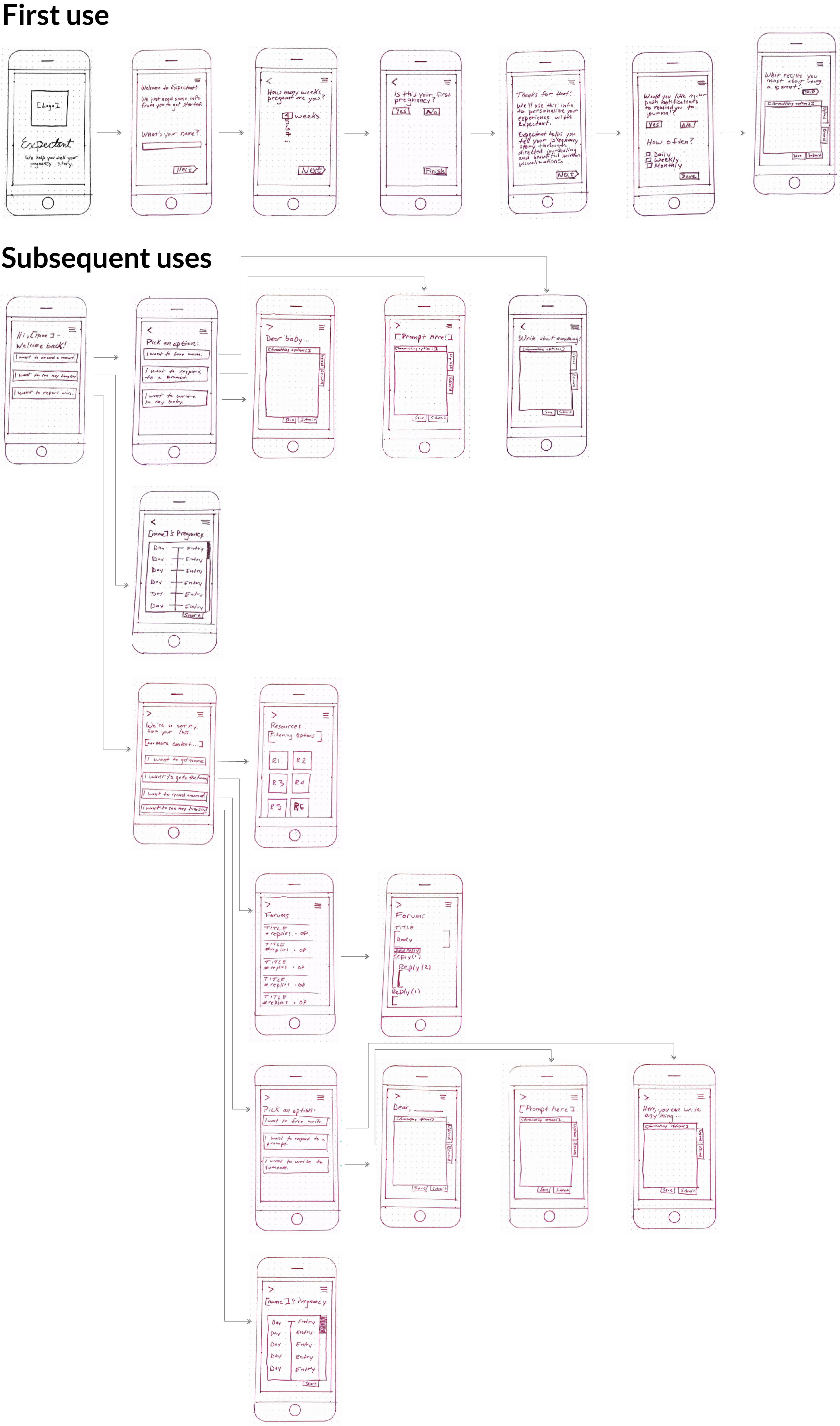
During onboarding, a user is asked
- Their first name,
- How many weeks pregnancy they are,
- If it’s their first pregnancy (and if not, which number it is), and
- Whether they’d prefer to receive regular push notifications as reminders to journal (and if so, how frequently)
From there, users can engage in directed journaling — they’re given prompts about what they’re most excited about for their child, what parenthood means to them, etc. To respond, users can type directly into the app; upload documents, audio, video, or photos; or natively record audio or video or take photos. (They can save, edit, or delete responses at any time, too.)
After on-boarding, each subsequent use of the app will ask the user whether to want to
- Record a “moment” – This could consist of free-writing, responding to a prompt, or writing to their baby.
- Review their timeline – This will display a visualization of the user’s recorded moments throughout their pregnancy, in whatever format they’ve used (text, audio, video, photo, etc.). This will be, for users, a narrative thread of what they’ve experienced throughout their pregnancy that they can share with others.
- Report a loss In this case, Expectant will offer users tailored resources and access to community forums, in addition to their timeline and to opportunities to free-write, respond to loss-specific prompts, and write to someone (whether their lost baby, their partner, etc.)
Low-fidelity Prototype
Here’s a low-fidelity prototype of what this might look like.

Next Steps
- Voice & Tone and Style Guide Creation
- Medium-fidelity Prototype
- Usability Testing
- Refinement